Friday, February 26, 2010

Illustrations for Notes from the Deanery


I was asked to create three illustrations for Rick Court's blog. One header image and two smaller spot images. These images are based on the post titled "Introductions".

In this post Rick talks a lot about his past and how he got to where he is today. My header image is based on the section where he is talking about working in the blast furnaces at Dofasco. It shows a furnace with fire coming out of it, as well as a bunch of words that start with H. Rick said this job was horrible so I put that coming out of the furnace. Every other word I thought of started with H, so I thought I'd stick with this pattern..

On the right here is one of my spot images, the first image I finished. It is based on the part where Rick talks about the farm burning where the chestnut tree stood. This is a vector I made, based on the flammable warning label. It's simple and a symbol of his childhood being destroyed..
The image placement in this blog is an example of how the spot images would be placed on Rick's blog.

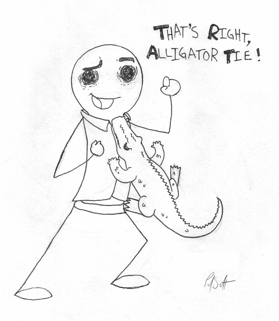
My third and final image, on the left here, comes from the part where Rick states, "Apparently wearing a tie to work was more important than making money." I thought what that would be like, I thought I could make a funny image in a work setting. Then I just thought of many ridiculous things that someone could wear as a tie, and an alligator was one of those things. Just a quick ink drawing of a simple character wearing an alligator as a tie.

Wednesday, February 24, 2010

Laptop Skin


A laptop skin design that's going on my MacBook. I coloured it using mostly CMYK. The image is of a speaker with the lyrics to Daft Punk's song Technologic. I wanted it to look as if it were one with my black MacBook so I added some black drips, cracks and the gradient border to the image to help.
This is available in my store as a laptop skin, print, ipad skin/case, mobile phone skin/case and more!

Tuesday, February 23, 2010

Illustration Friday - Propagate

Propagate

I drew this for the Illustration Friday topic, propagate.
Even though the female bedbug has it's own sex organ, the male bedbugs don't bother with it. The male will instead impale the female with it's sword like sex organ and deposit sperm this way.

I like how this turned out, I like the border I drew around the image and the speech bubbles.

Tuesday, February 16, 2010

Illustration Friday - Adrift

Adrift


I drew this for the Illustration Friday topic, adrift.
This drawing is of the main character, Isaac Clarke, from the video game Dead Space. Isaac's head and arm more specifically, he unfortunately got attacked by that Leaper creature. Now his severed body parts are drifting through space.
I recently purchased this fabulous game and have just completed it tonight, and it was amazing! The word adrift made me think of the constant ventures into zero gravity areas in this game.
And despite the background being white, this is definitely in space.

Saturday, February 13, 2010

Cereal Ad Storyboard Thumbnails

Cereal Ad Storyboard idea.


1. A silhouette of a female running.
2. Close up of the running female, she is sweating and panting.
3. Close up of a vampire.
4. We see the vampire chasing the female.
5. The female runs into an old crumbling house.
6. She trips on something.
7. The vampire has the female cornered.
8. Close up of the vampire going in for the attack.
9. The female reaches around for anything she can defend herself with. She holds up a box of Wild Pops Cereal
10. The vampire changes into a bat and flys away hissing and shrieking.
11. Tag line "Wild Pops - A Powerful Force".

Friday, February 12, 2010

MIRP - MSTRKRFT


The monster I saw at MSTRKRFT's DJ set in November.

Check out the slick new blog Monsters in real Places and participate!

Monday, February 8, 2010

Illustration Friday - Muddy

Muddy


I drew this for the Illustration Friday topic, muddy.
I was originally just going to have the cute looking rhinoceros in the image, but I then decided to make it a little more evil. Rhino doesn't even know what's coming.

And that's my hand writing..

Wednesday, February 3, 2010

Wild Pops - Cereal Ad

This was a project done for Modern Design Illustration class at school. These are all of my illustrations for my cereal ad, from rough concept to final drawing. The idea was to take our cereal box designs, which was aimed at kids, and make an ad that appeals to a different audience.


I wanted to make my ad appeal to people who are interested in music and DJ culture. I decided to sketch some headphones with cereal pieces rolling out of them, and a sticker of my character would be on the headphones.


I then used this image as a reference for my next ad concept. I decided to have the cereal pieces float out of the headphones instead. The pieces would float into a music bar and become part of the notes. I inked the headphones so I could turn it into a vector, and made a thick outline for it to stand out.


This is my colour comp. of my ad idea that I drew in Adobe Photohop. I wanted the headphones to be on the corner of a table or desk with the music bar and notes floating above.
I added a vector image of my cereal's character to the headphones, and added a white border to it so it would look like a sticker.


This is the vector I made in Adobe Illustrator from my inked headphone drawing. I live traced and live painted it to get a clean look.


This is the final ad, put together in Adobe Photoshop. It has my final vector drawing of the headphones, I moved the the character sticker so it looks like it's on a curved surface.
Instead of a table top I decided to take a picture of my turntable and make it a black and white image.
I scanned a plastic bag and made it a texture for my background. I added some green and faded the background toward the turntable.
The word "Pop" is in the Wild Pops font. And I chose a font for the other words that relates to the theme. I knew I wanted to include platter in my catch phrase as it could relate to the turntable platter and a platter for food.
The image in the bottom left corner is the cover of my cereal box that I scanned in. The actual product that the ad is for.

Enjoy!

Monday, February 1, 2010

Illustration Friday - Focused

Focused


I drew this for the Illustration Friday topic, focused.
I was originally going to have the right hand holding a scalpel cutting into someone's face, but I thought of that as too elaborate, didn't know if I would have enough time to complete it. It also would have reminded me of Dexter. I found this more suitable since I injured my finger recently and it still has about 3 weeks of healing to go..
One should focus when giving oneself stitches..
Artwork © 2007-2019 Paul Scott